Guest Bathroom Decor & Utilizing Vertical Space
Blogmas Day 1!

A while ago I did a reveal of our guest bedroom and today I wanted to show you guys our guest bathroom!
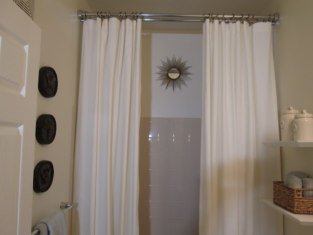
The original theme I wanted for this bathroom quickly changed when the paint color didn't turn out like I had imagined (I never knew how difficult is was to pick a white!). It turned out more of a warm color, especially when you turn the lights on in there, so I just rolled with it. Instead of a white shower curtain I decided to go with ivory and then began picking accessories that were warmer toned for a sort of tropical feel.
Our guest bathroom is pretty small, so I knew I wanted to hang the shower curtain all the way at the ceiling to utilize the vertical space. It was a little bit of a challenge to find the double shower curtain rod and the correct length of curtain but with a little googling we got everything we needed. I didn't want the actual curtains to move very often, which is why I opted for the double curtain rod, this way only the shower liner moves when someone takes a shower. I also wanted them to be 96" and sit perfectly on the floor so that's how the rod was hung.
I found the wall plaques in a Ballard Designs magazine and immediately knew I wanted them for this bathroom. They have 3 different insects with their classifications, which I've always thought was neat and the bronze color was perfect. I opted to hang them in a straight line going up the wall as an added way to draw your eyes up when you're in there and they worked perfectly for that. In addition to the plaques, whenever anyone sees the bathroom for the first time I always hear, "Is that a mirror in the shower??" Yes, there is a mirror ABOVE the shower because as I said, the shower curtains don't move and I thought they perfectly framed the mirror and gave your eyes something to look at towards the top of the wall.
The floating shelves add a little storage and visual interest while still being modern and not taking up much space. I much preferred the shelves option to one of those above-the-toilet cabinets because the bathroom is already small, so I didn't want to close it in even more with a piece of furniture.
I'm really happy with the way this turned out. I love that when you walk in, your eyes immediately go up with the shower curtain and then up with the bronze plaques and use that area that typically is dead space.
Let me know what you think!
Shower curtain rod: Signature Hardware
"Shower" curtain: Pottery Barn
"Shower" curtain hooks: Pottery Barn
Basket: Home Goods
Towels: Costco
Bronze Plaques: Ballard Designs (Comes in 3 colors)
Sunburst Mirror: Pier 1 (I got the petite)
Pineapple night light plug in: Bath and Body Works


I love this! and I love how you hung the shower curtains high to make the space look bigger!
ReplyDelete-Sisi
Modern Beauty Girl
Thank you! I was so excited that my vision worked out haha :)
DeleteI absolutely love this bathroom! So clean and classic chic looking!!!!
ReplyDeleteThanks, Julie! I'm happy with it :)
DeleteThe whole bathroom just give me a fresh and pure feeling. Actually, I'v read an article about bathroom sinks.
ReplyDelete